RocRedWing Verified Member Posted June 10, 2024 Posted June 10, 2024 Looks like an enterprising redditor found a potential leak to what the Twins city connects will be tomorrow via the official MLB Stance socks page. woof.
Riverbrian Old-Timey Member Posted June 10, 2024 Posted June 10, 2024 If a tree falls while the broadcasting rights are being held hostage. Does it make a sound? Jerr, LewFordLives and USAFChief 3
Dave Borton Verified Member Posted June 10, 2024 Posted June 10, 2024 https://www.mlb.com/twins/fans/city-connect?partnerId=it-20240610-10084239-min-1-A&utm_id=it-20240610-10084239-min-1-A
Patzky Old-Timey Member Posted June 10, 2024 Posted June 10, 2024 12 hours ago, RocRedWing said: Looks like an enterprising redditor found a potential leak to what the Twins city connects will be tomorrow via the official MLB Stance socks page. woof.
2wins87 Verified Member Posted June 10, 2024 Posted June 10, 2024 The overall look is better than I would have projected just from the sock, but I'm still a little underwhelmed. I might get the hat
DJL44 Old-Timey Member Posted June 10, 2024 Posted June 10, 2024 City connect uniforms make me glad I listen to games on the radio chpettit19, LewFordLives, RocRedWing and 8 others 5 5 1
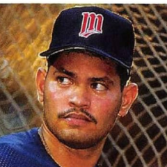
Original_JB Verified Member Posted June 10, 2024 Posted June 10, 2024 Hah! The hat already come pre-customized for me! Outside of the hat, not a fan though. I get the idea, but with the weird "see through" uni issues this year, the jerseys look sort of like they are semi transparent with something else underneath (I know they are not, but they appear that way). Not a fan of the yellow. Are we from Milwaukee?
wabene Verified Member Posted June 10, 2024 Posted June 10, 2024 They should donate proceeds to clean up Minnesota's water polluted by agriculture. Pohlads, tap tap tap, is this on? Richie the Rally Goat 1
Patzky Old-Timey Member Posted June 10, 2024 Posted June 10, 2024 Looks good! I was really wanting some powder blue.. Craig Arko 1
SF Twins Fan Verified Member Posted June 10, 2024 Posted June 10, 2024 These are terrible. Where does the yellow come from - I don't believe that's ever been on a Twins uniform before. Jerr 1
Original_JB Verified Member Posted June 10, 2024 Posted June 10, 2024 Oh, and I guess no Sponsor patch either. Thought for sure this would be the best (delayed) time to introduce it. Or are we being sponsored by the MLS Minnesota United?
RocRedWing Verified Member Posted June 10, 2024 Author Posted June 10, 2024 4 minutes ago, SF Twins Fan said: These are terrible. Where does the yellow come from - I don't believe that's ever been on a Twins uniform before. Per the website, the yellow is for "a sunset over a lake." lol. Vanimal46, CrossCheckRepublic and SF Twins Fan 3
danielp19653 Verified Member Posted June 10, 2024 Posted June 10, 2024 Overall I think the unis are fine, certainly are worse city connects out there. Hate the yellow, just feels really off for a Twins uniform, but the rest is meh. Certainly don't like them enough to buy them but with the costs of jerseys I can't say I like the normal ones enough to buy them.
Aggies7 Old-Timey Member Posted June 10, 2024 Posted June 10, 2024 I don’t think I’ve ever seen one of these city connect jerseys that looked good. And ours are no exception, utter doggy doo doo 🤮 MLB cleverly devised a way to sell more merch. That’s all it’s ever been about Dave Borton, KirbyDome89, RocRedWing and 2 others 5
umterp23 Verified Member Posted June 10, 2024 Posted June 10, 2024 I like them compared to some really bad designs: https://www.espn.com/mlb/story/_/id/39776958/tracking-mlb-city-connect-jerseys-uniforms
Vanimal46 Old-Timey Member Posted June 10, 2024 Posted June 10, 2024 5 minutes ago, Aggies7 said: I don’t think I’ve ever seen one of these city connect jerseys that looked good. The Padres one is so different and vibrant that it’s actually cool. This one for the Twins? Hideous. We trying to be the Brewers now? Original_JB, Aggies7, SF Twins Fan and 1 other 4
DJL44 Old-Timey Member Posted June 10, 2024 Posted June 10, 2024 It is ironic that a "City Connect" themed uniform would highlight loons and sunsets over lakes, "MN" and the outline of the state and lots of other things that have little to do with the Twin Cities. The "TC" cap is more "city connect" than these uniforms. Can we call them the "City Disconnect" uniforms? NotAboutWinning, Original_JB, Vanimal46 and 3 others 5 1
Vanimal46 Old-Timey Member Posted June 10, 2024 Posted June 10, 2024 The hat looks like something already for sale at the MSP Airport gift shop. DJL44 and LewFordLives 1 1
Teflon Verified Member Posted June 10, 2024 Posted June 10, 2024 I didn't see any references to this being the Gopher State. I suppose there might have been some confusion with this also being the Gopher Ball State. Also, since the Twins brought it up, shouldn't it be: "The Purifying Waters of Lake Minnetonka?" Richie the Rally Goat, USAFChief, RocRedWing and 1 other 4
2wins87 Verified Member Posted June 10, 2024 Posted June 10, 2024 I guess the First Ave/Atmosphere tease was just a teaser to their intro video, not the Jersey itself. I have mixed feelings, but mostly negative. I'm sort of glad we didn't get another black/gray city connect. Nike seemed to really love making everything black. But I don't know if these colors are really an improvement That said, I think a First Ave/Music theme could have been cool, even if that would have meant primarily black and silver. I think these suffer from a general unwillingness from the team to ever get more local than the Twin Cities with branding, and a general desire to as broad geographically as possible. I get it from a marketing perspective but they ended up with the most basic and obvious concept. Minnesota=10,000 Lakes. Anyone outside of Minnesota that knows one fact about the state knows that one. I assume they got design input from locals, but they certainly didn't need it at all to come up with this design. I think if they would have been willing to risk alienating a few people for something Minneapolis-specific they could have come up with a more interesting design. Is Tampa Bay known for skateboarding culture? I don't know, but people from there seem to think so and they ended up with an interesting and unique design. We ended up with a real boilerplate design that will have zero lasting power.
Craig Arko Old-Timey Member Posted June 10, 2024 Posted June 10, 2024 I like them. Also think some powder blue would have been a nice addition.
bean5302 Verified Member Posted June 10, 2024 Posted June 10, 2024 The jersey looks cheap and piecemeal, the way the "ripple" changes directions at the jersey sewing points. Something I would have done with a sewing machine as a kid in Home Economics. There are some city connect jersey's I really like, but a lot I don't. This is definitely a "don't like." Squirrel 1
Aggies7 Old-Timey Member Posted June 10, 2024 Posted June 10, 2024 I thought I had seen the absolute worst twins jersey on earth, until today
USAFChief Twins Daily Contributor Posted June 10, 2024 Posted June 10, 2024 6 hours ago, GCTF said: Beyond fugly. "B-fugly" in today's vernacular GCTF 1
CrossCheckRepublic Verified Member Posted June 11, 2024 Posted June 11, 2024 I guess 'forgettable trash' is better than 'eyesore I will never forgive them for trash'?
jctwins Verified Member Posted June 11, 2024 Posted June 11, 2024 I was at the ballpark tonight. They clearly intend to cash in on the new merch. It made me wonder if the Pohlads installed a bell that would ring every time someone bought a new jersey. Clearly MLB sees the value in marketing, though, and stuff will sell because it's new, and not because it's good.
Dasan Hill Cedar Rapids Kernels - A+ SP Dasan Hill was the key piece heading to the Toronto Blue Jays organization in the Jeff Hoffman trade. Explore Dasan Hill News >
Recommended Posts
Create an account or sign in to comment
You need to be a member in order to leave a comment
Create an account
Sign up for a new account in our community. It's easy!
Register a new accountSign in
Already have an account? Sign in here.
Sign In Now