



Brock Beauchamp
-
Posts
32,665 -
Joined
-
Last visited
-
Days Won
328
Content Type
Profiles
Minnesota Twins News, Rumors & Analysis
Minnesota Twins Videos
2026 Minnesota Twins Top Prospect Rankings
2022 Minnesota Twins Draft Picks & Signing Bonuses
Minnesota Twins Trade & Free Agent Rumors
Minnesota Twins Fan Guides & Resources
2023 Minnesota Twins Draft Picks & Signing Bonuses
The Minnesota Twins Players Project
2024 Minnesota Twins Draft Picks & Signing Bonuses
2025 Minnesota Twins Draft Picks & Signing Bonuses
2026 Minnesota Twins Draft Picks & Signing Bonuses
Forums
Blogs
Events
Store
Downloads
Gallery
Everything posted by Brock Beauchamp
-

Berardino: Twins close to extension with Dozier
Brock Beauchamp replied to PseudoSABR's topic in Minnesota Twins Talk
Yeah, but Dozier has little reason to listen to an offer with only team options. You're not going to get him to the table unless you buy out at least one year of FA at a fair price. Why would Dozier lock himself up for eight years of control with team options that would surely pay him less than he'd make on the open market? If he's not worth the option price, the team declines. It's a lose-lose for Dozier. -
While I'm not crazy about tinkering with Hughes, Allen seems smart enough to keep the fiddling to a minimum. Changing a successful pitch would have me a lot more concerned than trying to reincorporate a previously discarded pirch.
-
Yikes. I've questioned some of the Rangers' moves over the past few years but this one still stings.
-
Yep, spotted my first one this morning. John and I are going to meet about this later in the week. Frankly, I'm pretty pissed about it. I feel like I've been through this circus 100 times with the ad networks and I'm tired of having this conversation with them.
-
You're getting auto redirects? Unacceptable. Are you on mobile or desktop when it happens?
-
Berardino: Twins close to extension with Dozier
Brock Beauchamp replied to PseudoSABR's topic in Minnesota Twins Talk
If Dozier repeats his 2014 campaign in 2015, how much more will it cost the Twins to sign him in 12 months than it would today? $3-5m? Less than or equal to the amount they're paying Pelfrey this season, almost surely. I'm not really against a Dozier extension but I don't really see a point in falling over yourself getting it done right this second. -
Article: Ryan believes Twins can contend in 2015
Brock Beauchamp replied to jimmer's topic in Twins Daily Front Page News
Preseason SoS doesn't mean a whole lot. Mid-season SoS, yes... But I struggle to put much weight into predicting the strength of teams before a game has been played. -
Article: Ryan believes Twins can contend in 2015
Brock Beauchamp replied to jimmer's topic in Twins Daily Front Page News
I'd be thrilled with a repeat of 2001. Stay in it until August or so and then fade as the young guys struggle a bit and figure out how to adjust. -
Zulgad: Hicks Confident He Can Contribute
Brock Beauchamp replied to Seth Stohs's topic in Minnesota Twins Talk
I couldn't do anything but laugh when that happened last night. I believe my quote from the game thread was: "OMG, Hicks. Come on, man." I was hoping that after the play, the camera would pan over to right field and show Hunter on the ground, doubled over in laughter. -
A starter putting up a 4 ERA is no longer impressive. While using ERA to judge a reliever isn't good analysis, anything over a 3 ERA starts ringing bells in my head.
- 43 replies
-
- 1
-

-
- glen perkins
- casey fien
- (and 1 more)
-
The problem with bullpen analysis is that it relies on past performance and bullpens are so volatile that you can't rely on anything but the best relievers to repeat past glories. Of course, there's really no other way to analyze a bullpen so there's that. The bullpen is a mild concern of mine going into this year... But it's a mild concern of mine every year because the damned things are so unpredictable.
-
Article: Ryan believes Twins can contend in 2015
Brock Beauchamp replied to jimmer's topic in Twins Daily Front Page News
Not terribly surprising. GMs are almost forced to say that kind of thing from a public relations perspective. If you put a gun to Ryan's head, I think he'd admit that 80 wins would make this season a success. -
Spring Training Game 1: Twins/Red Sox @ 6:05
Brock Beauchamp replied to Seth Stohs's topic in Archived Game Threads
No, not really weird... The smaller you make an icon, the more problematic an outline around that icon becomes. On a big "Twins" script on a jersey, a gold outline adds a little style to the big, bold script. On a hat, the "TC" logo is much smaller. The outline causes eye distraction and ruins what were clean lines around the interlocked letters on the old hats. -
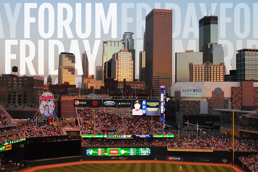 Kiley McDaniel has reported that the Twins have a deal in place with 16 year old Dominican shortstop Wander Javier, ready to sign the youngster when he become eligible on July 2. If true, this would mark the largest international deal signed in Twins history, rivaled only by Miguel Sano’s 2009 signing. Twins rumored to have $4m deal with Dominican shortstop Brian Dozier has become quite the hot topic among Twins fans: should he be extended or should the Twins give it more time? No matter on which side of you coin you fall, it appears the Twins are closing in on an extension with the breakout second baseman, per Mike Berardino. Twins Close to Dozier Extension Pitch framing statistics are all the rage in MLB right now… But what about the minors? How can good or bad pitch framing alter our perception of pitching prospects? Pitch Framing in MiLB Spring training has officially arrived and that means the return of the Twins Daily game thread! Follow the game along with other Twins Daily members and remember, there’s a new game thread for every… game… this… season… Spring Training: Twins vs. Red Sox In Vikings News: Wednesday morning, Vikings fans were surprised to learn that Matt Cassel, the assumed backup quarterback in 2015, had been traded (technically, the trade can’t happen for a few more days) to the Buffalo Bills for a pair of draft picks. Cassel Traded to the Bills In Wild News: Of all the trade deadline deals executed by Fletcher in 2015, the Chris Stewart acquisition was definitely the most controversial among Wild fans. Was a second round pick too much to give up? Cast your vote in the poll and let us know! Is a 2017 2nd Round Pick too much for Stewart?
-
Spring Training Game 1: Twins/Red Sox @ 6:05
Brock Beauchamp replied to Seth Stohs's topic in Archived Game Threads
OMG, Hicks. Come on, man. -
Spring Training Game 1: Twins/Red Sox @ 6:05
Brock Beauchamp replied to Seth Stohs's topic in Archived Game Threads
It's a sit/stand desk because I knew I'd have to go back and forth between sitting and standing, particularly early on. It's going to take some time to adjust. -
Spring Training Game 1: Twins/Red Sox @ 6:05
Brock Beauchamp replied to Seth Stohs's topic in Archived Game Threads
I've been working at a standing desk for close to four hours now. It's really starting to kick my ass. -
Spring Training Game 1: Twins/Red Sox @ 6:05
Brock Beauchamp replied to Seth Stohs's topic in Archived Game Threads
Damn, that dude is strong. -
Spring Training Game 1: Twins/Red Sox @ 6:05
Brock Beauchamp replied to Seth Stohs's topic in Archived Game Threads
Joe Mauer starting 2015 by doing very Joe Mauer-type things. -
Spring Training Game 1: Twins/Red Sox @ 6:05
Brock Beauchamp replied to Seth Stohs's topic in Archived Game Threads
I dig the new unis. -
Spring Training Game 1: Twins/Red Sox @ 6:05
Brock Beauchamp replied to Seth Stohs's topic in Archived Game Threads
Brian Dozier starting 2015 by doing very Brian Dozier-type things. -
Spring Training Game 1: Twins/Red Sox @ 6:05
Brock Beauchamp replied to Seth Stohs's topic in Archived Game Threads
I was thinking a Hunter/Arcia platoon at cleanup might be a decent option until I realized that Hunter's splits were negligible last season (.753 vs righties, .799 vs lefties). -
Spring Training Game 1: Twins/Red Sox @ 6:05
Brock Beauchamp replied to Seth Stohs's topic in Archived Game Threads
Outside of Escobar at DH, that looks like the opening day lineup. -
With the Matt Cassel trade going down yesterday and baseball starting to ramp up, the server was beginning to wheeze a bit. I'm going to look into it over the next few days.
-
Hah! Well, the important thing is that I now know what is causing the issue, which is a huge step forward. I couldn't even begin to troubleshoot because I couldn't replicate the error.
